Cornerstone Lobby and Cafe
Cornerstone Church is all about "doing life together". They wanted their new lobby and café space to be a place where people would want to stay, connect, and ultimately grow closer to God. The new design had to appeal to a wide range of age groups and encourage vibrant relationships.
"Green Couch Design exceeded our every expectation!
We needed help with a major renovation and expansion of our lobby area. Our desire was to create an environment that would be welcoming and inviting to encourage people to not just walk through but rather linger and create community. We love seeing our congregation feel so comfortable and enjoying the new space. Cale and Meg sat down with us and listened to our overall vision and desire for the spaces and then brought us such creative ideas. They provided a clear picture of what the finished area would look and feel like. Green Couch’s ability to approach our project with a budget conscious mindset was a huge blessing. When you are dealing with a remodel of our size, you have a wide range of questions, voices, and opinions. It was a weight off of my shoulders to be able to confidently say; 'Although we appreciate your input, we are relying on our very capable design team to make the final decisions.
We have been utilizing this space for a several months now and I still hear people rave about it. I can’t take credit for the finished project but rather enthusiastically recommend and give kudos to Green Couch Design who brought our vision and desire to fulfillment."
- Carol Mckey // Pastor
Project Overview
Service: Commercial Remodel | Renovation Budget: $160K | Area: 7K SQFT
After years of small updates, Cornerstone Church was ready to renovate their lobby and café space in a big way. What used to be an old grocery store now hosts up to four weekly services, a thriving children's and nursery ministry, as well as small groups and gatherings. The Church was looking for a space that would ease the flow of traffic, encourage community, create a weekday waiting area for visitors meeting with staff, a welcome center, and an accessible, efficient, and spacious children's check-in area. The foundational elements of the remodel had to establish good bones for the next ten plus years and serve as a backdrop for holiday décor and special events. Green Couch Design's space design, planning, and project management services were required to keep aesthetics on point with the big picture vision, financials on budget, and schedules on task.
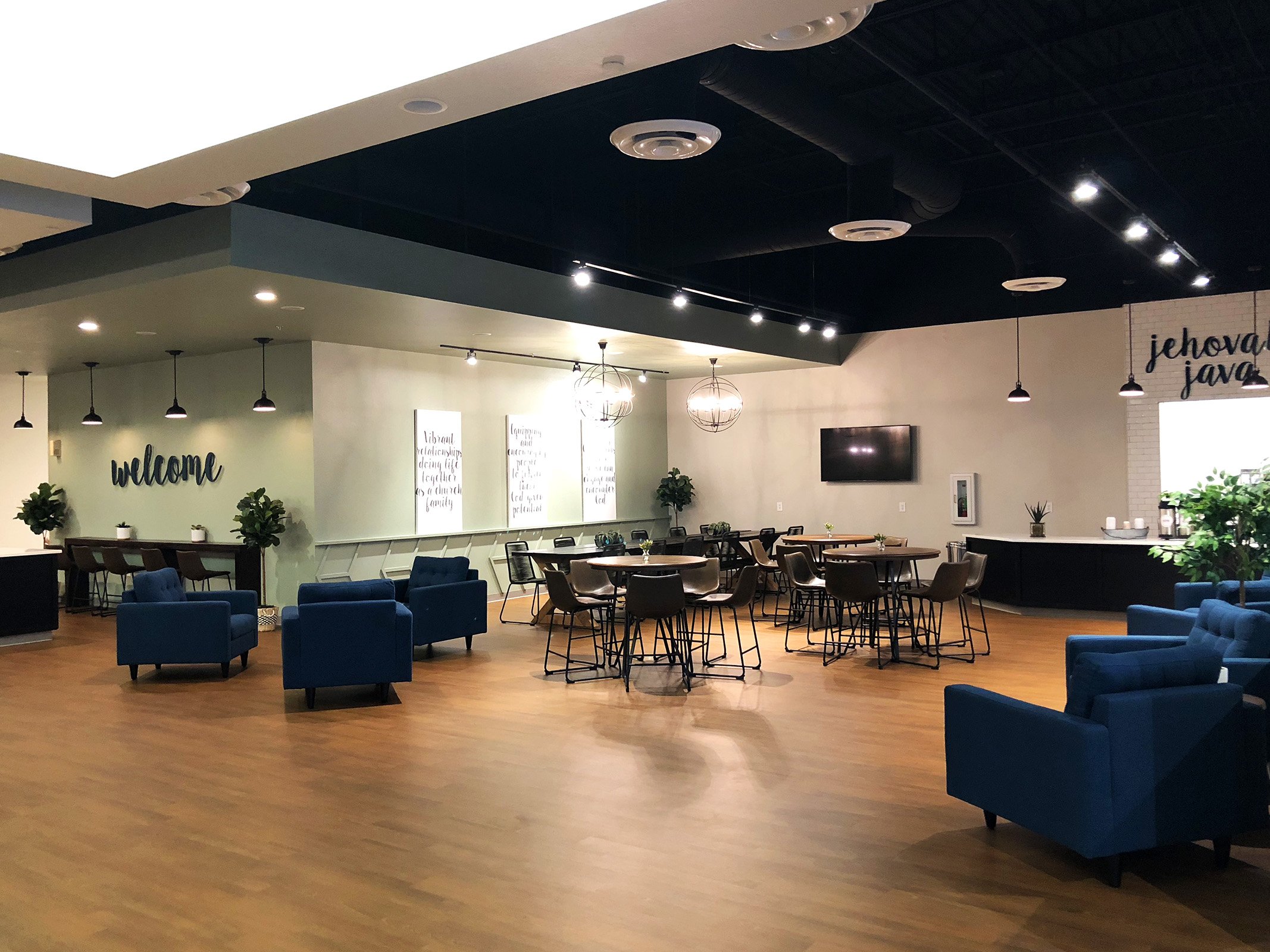
Floor Plan: Through a series of strategic questionnaires, Green Couch Design (GCD) was able to design around the Church's spatial needs. Originally, the coffee was served in a separate room right off the lobby but the new layout required the café area to open up seamlessly into the lobby space. Blueprints were required for proper demo, plumbing, electrical, and custom cabinetry for pantry and storage. To help soften sound and create a warm wood-look, the original tile flooring was removed and replaced with a luxury vinyl.
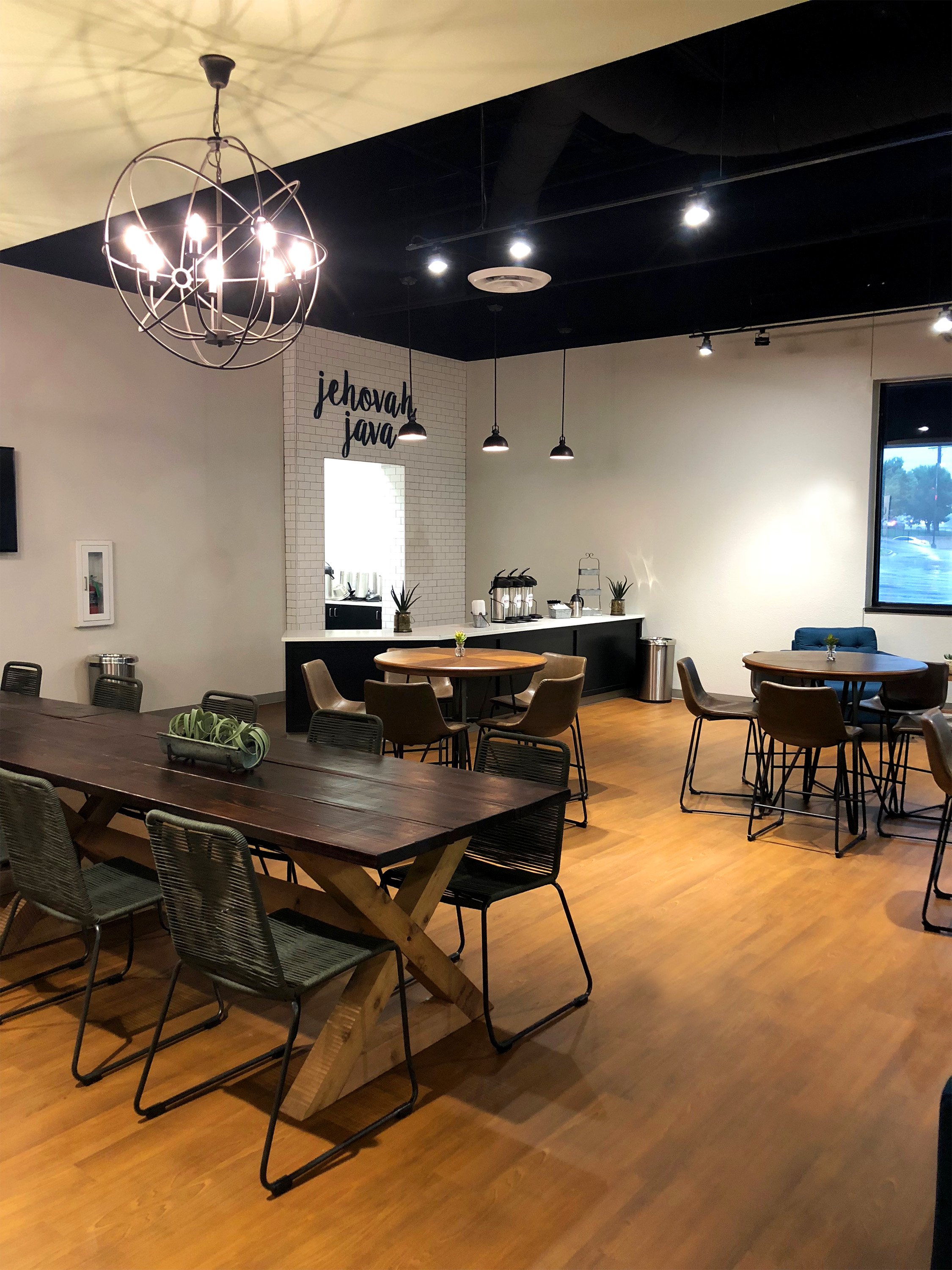
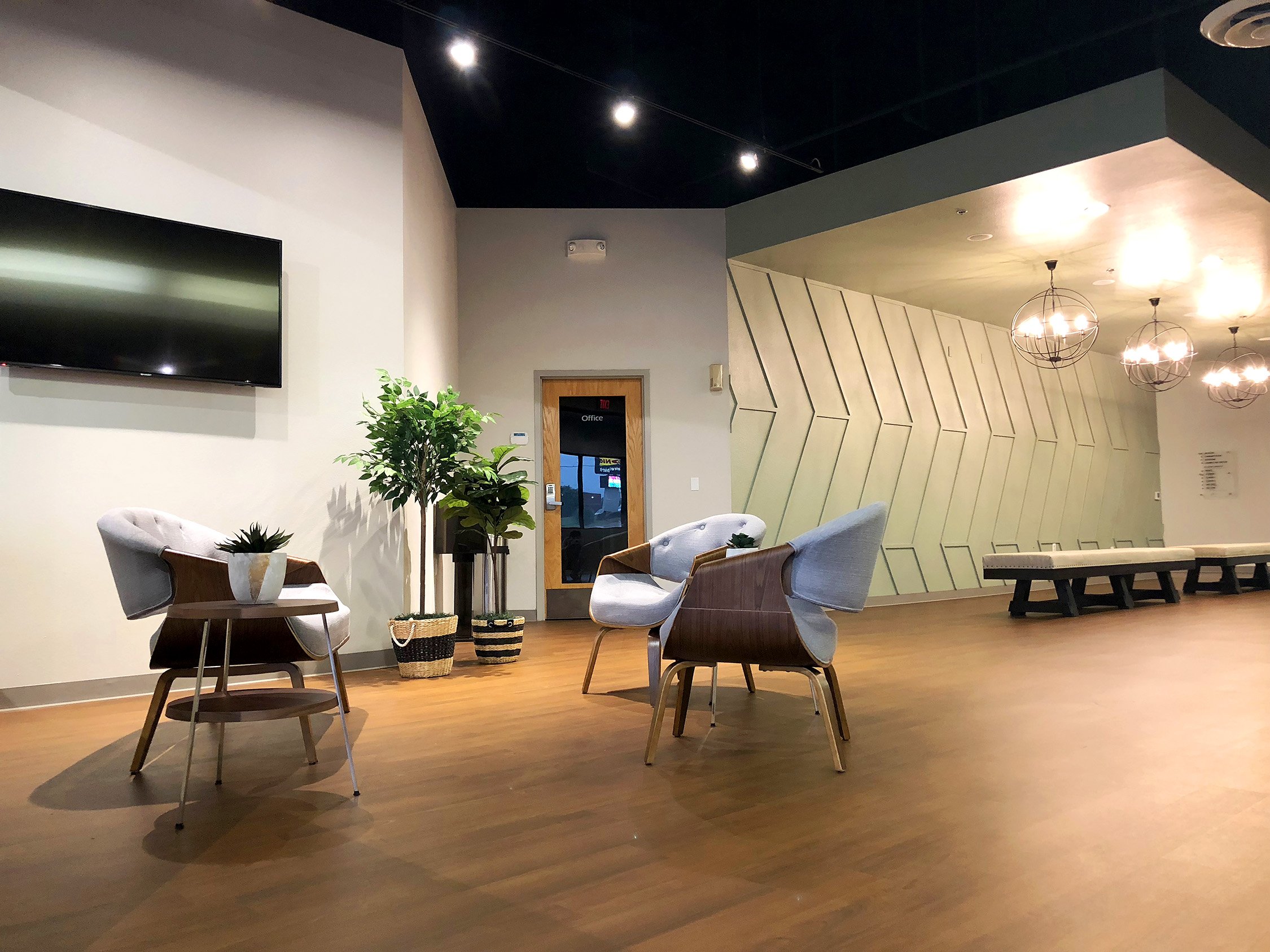
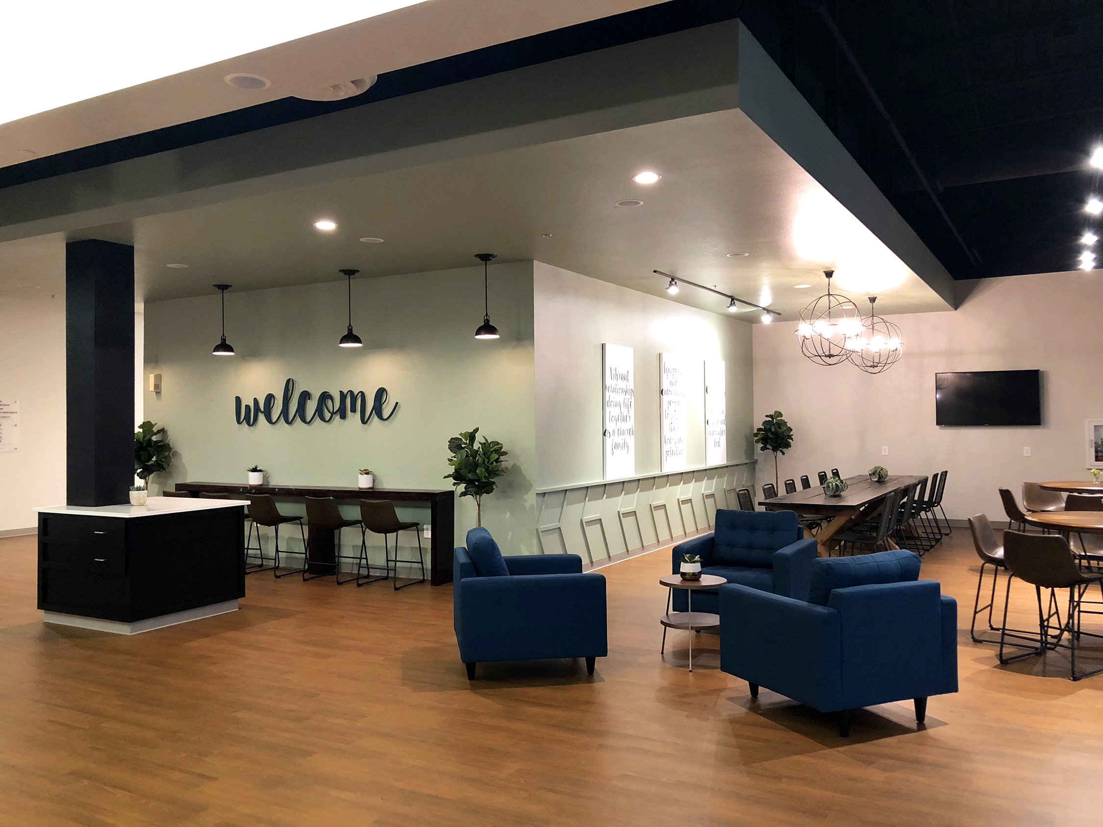
The new design raised the ceiling and exposed duct-work. Additional HVAC was required to ensure the system would keep up with the new open floor plan. GCD brought in ceiling clouds to create depth and varying heights within the space. Chandeliers hang from two of the clouds to ground seating areas and highlight the welcome center. Lastly, GCD widened one of the hallways right off the lobby, easing the flow of traffic and for the children's check-in area.
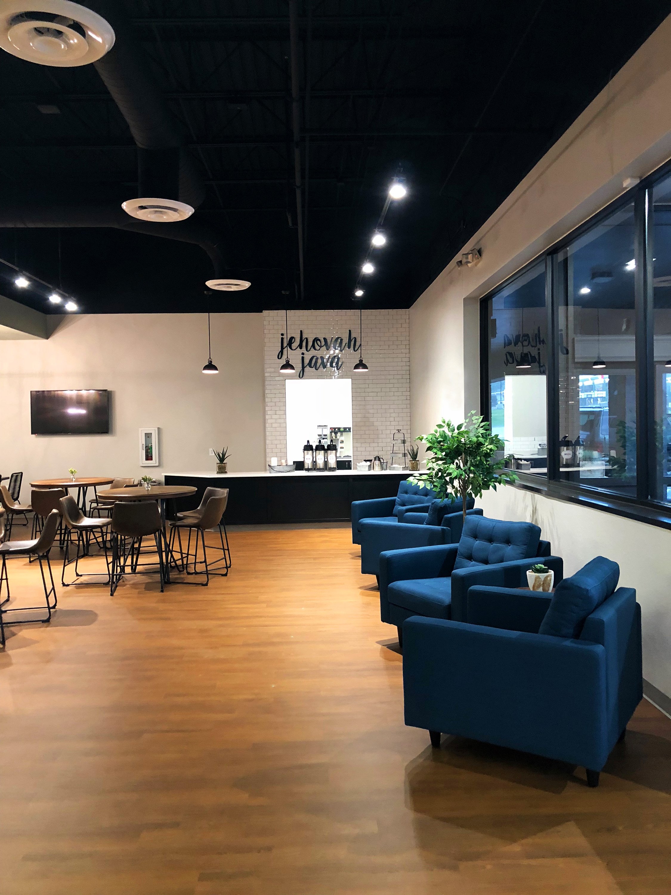
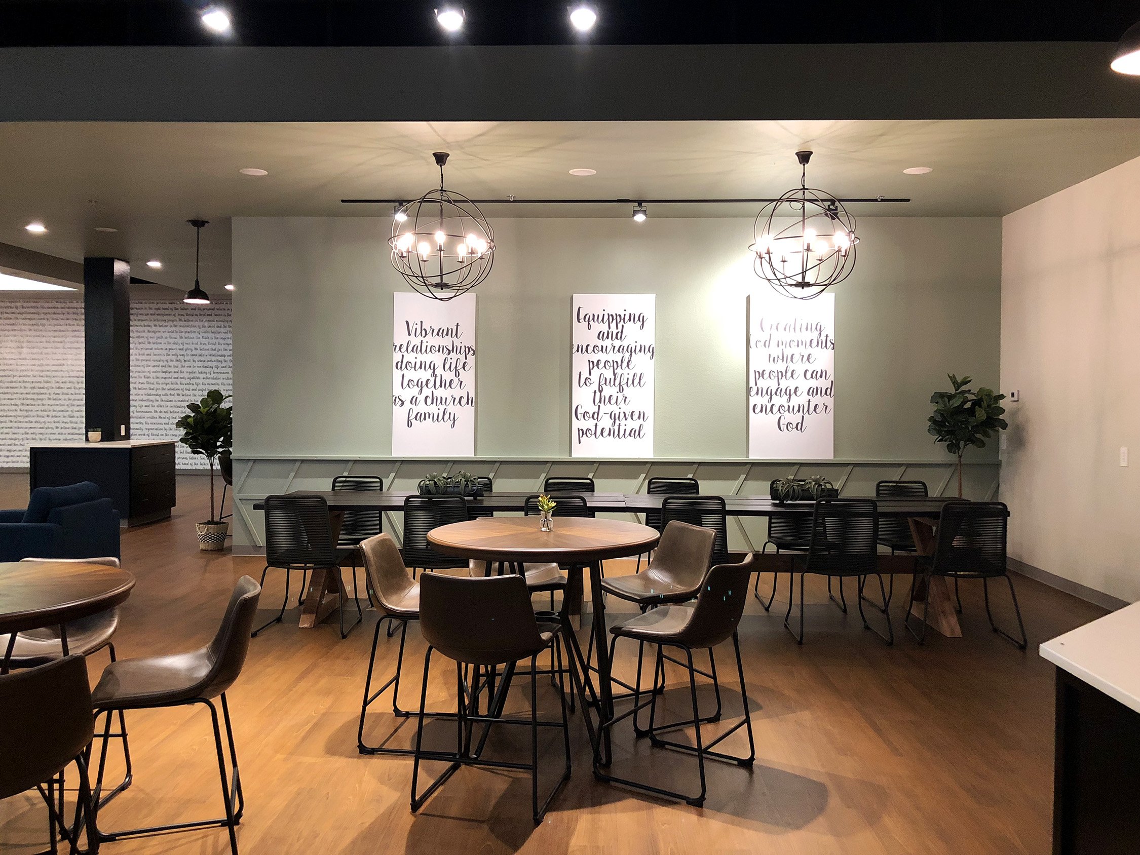
Paint: GCD introduced a fresh, yet timeless color pallet, flooding the walls with a light stone gray and sage green. Paired with the high contrast of a rich blue and charcoal black, the space is filled with elements of understated drama. From the black ceiling, cabinetry in the welcome center and cafe, and dark grout against the white subway tile, these elements serve as accent pieces providing texture and visual interest to the new space.
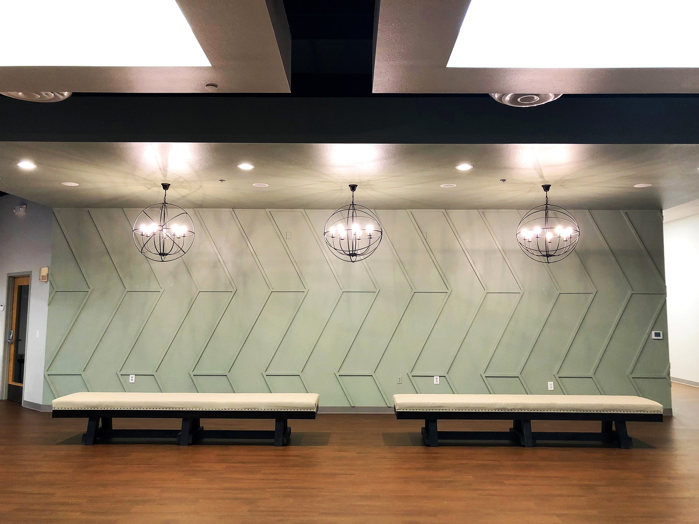
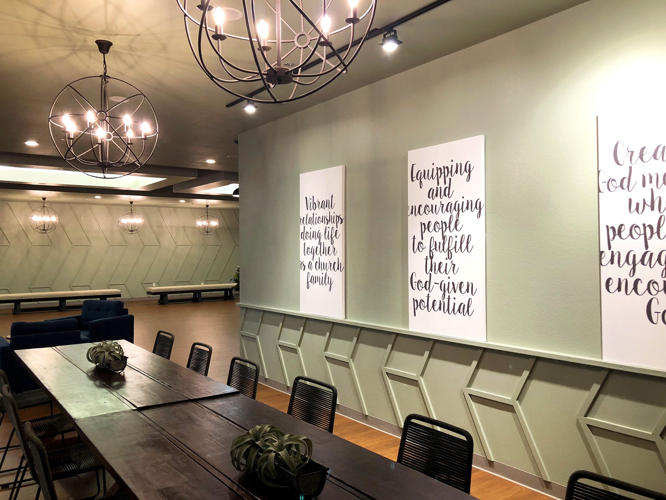
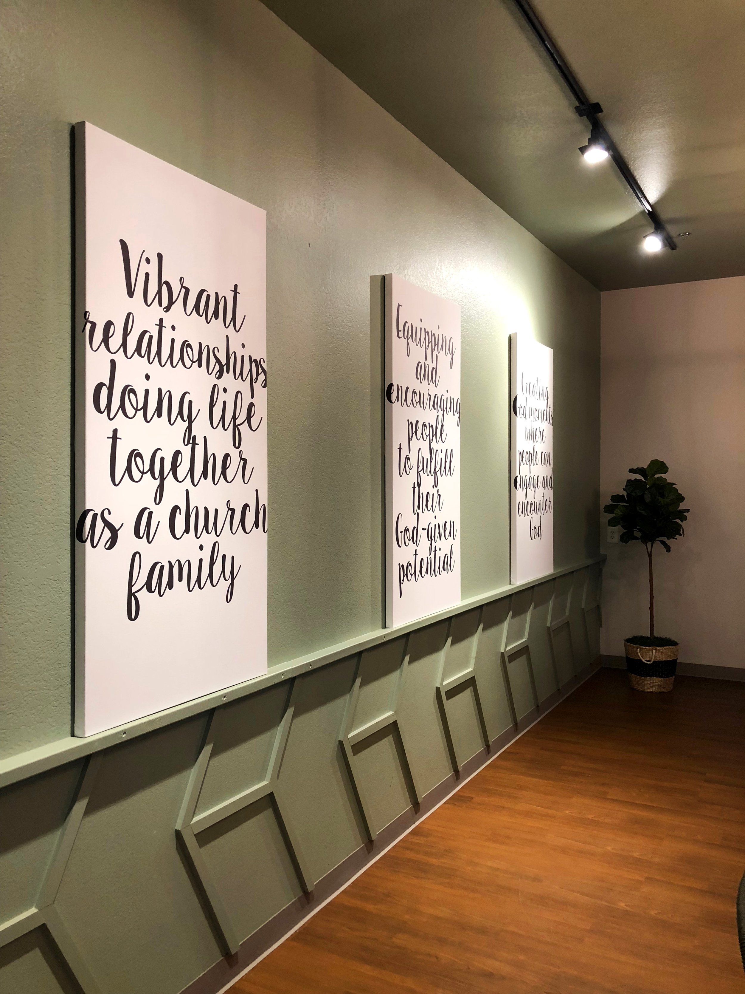
Paneled Wall and Benches: An updated version of shiplap, the paneled wall was our solution to creating a simple focal point with texture and minimal cost. The chevron pattern was easy to assemble with the help of volunteers and reflects the movement of the space. Located in the busiest thoroughfare of the lobby, we didn't want to fill the space with a bunch of heavy furniture. Instead we opted for two custom ten foot long benches that serve as perching stations for individuals waiting on friends and family before and after service(s).
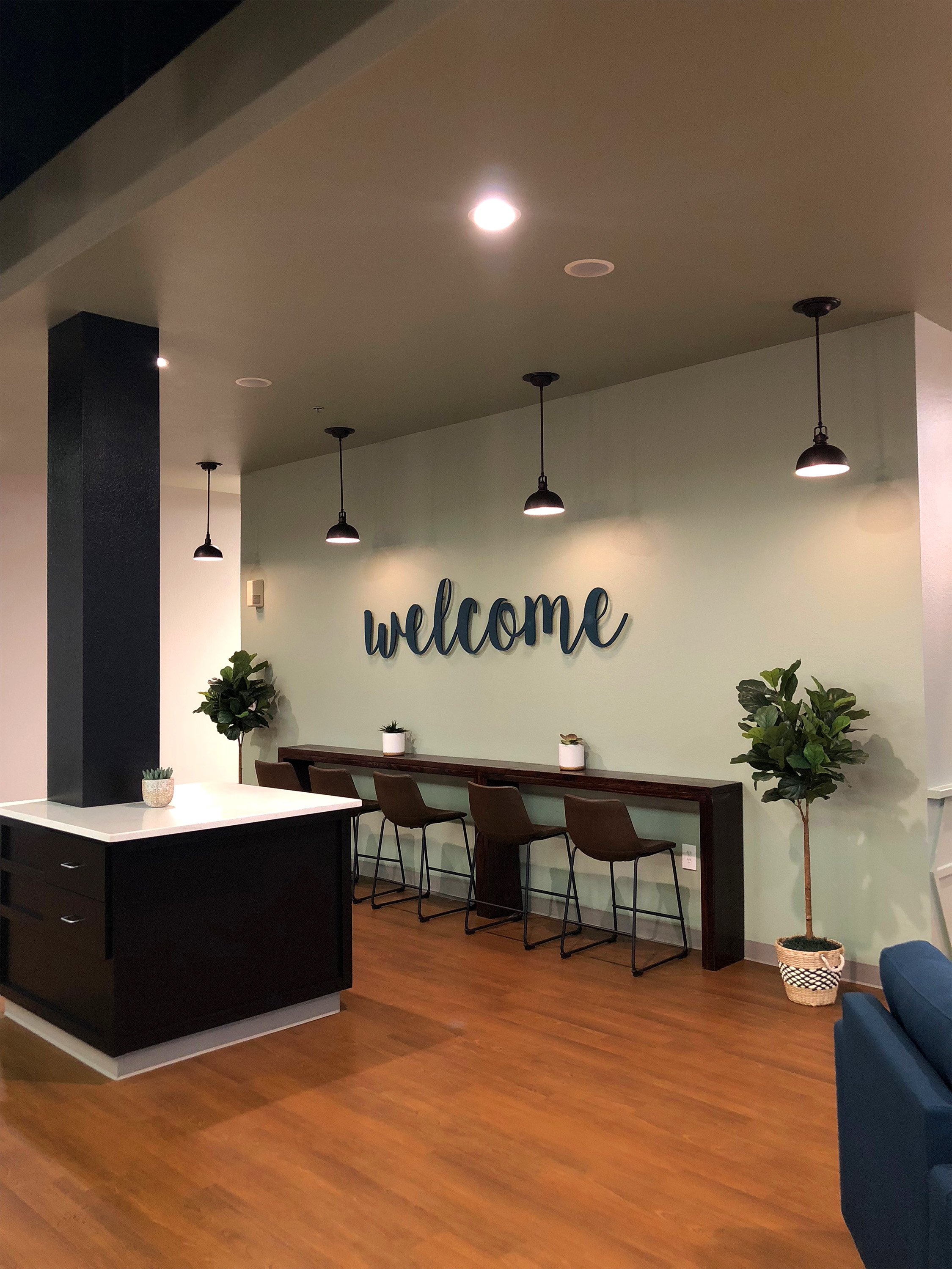
Welcome Center: Instead of designating a welcome center where visitors approach an oversized desk we created an island/kiosk system where volunteers can move around all four sides. The new layout provides digital pads for signups for events and up-to-date information. Over time, Cornerstone will be able to eliminate the need and cost for printed materials, save hours of staff time, keep the clutter at bay, and possibly implement and automate better systems for follow up and connection. GCD encouraged a more one-on-one casual interaction enabling the church to meet people's needs head on.
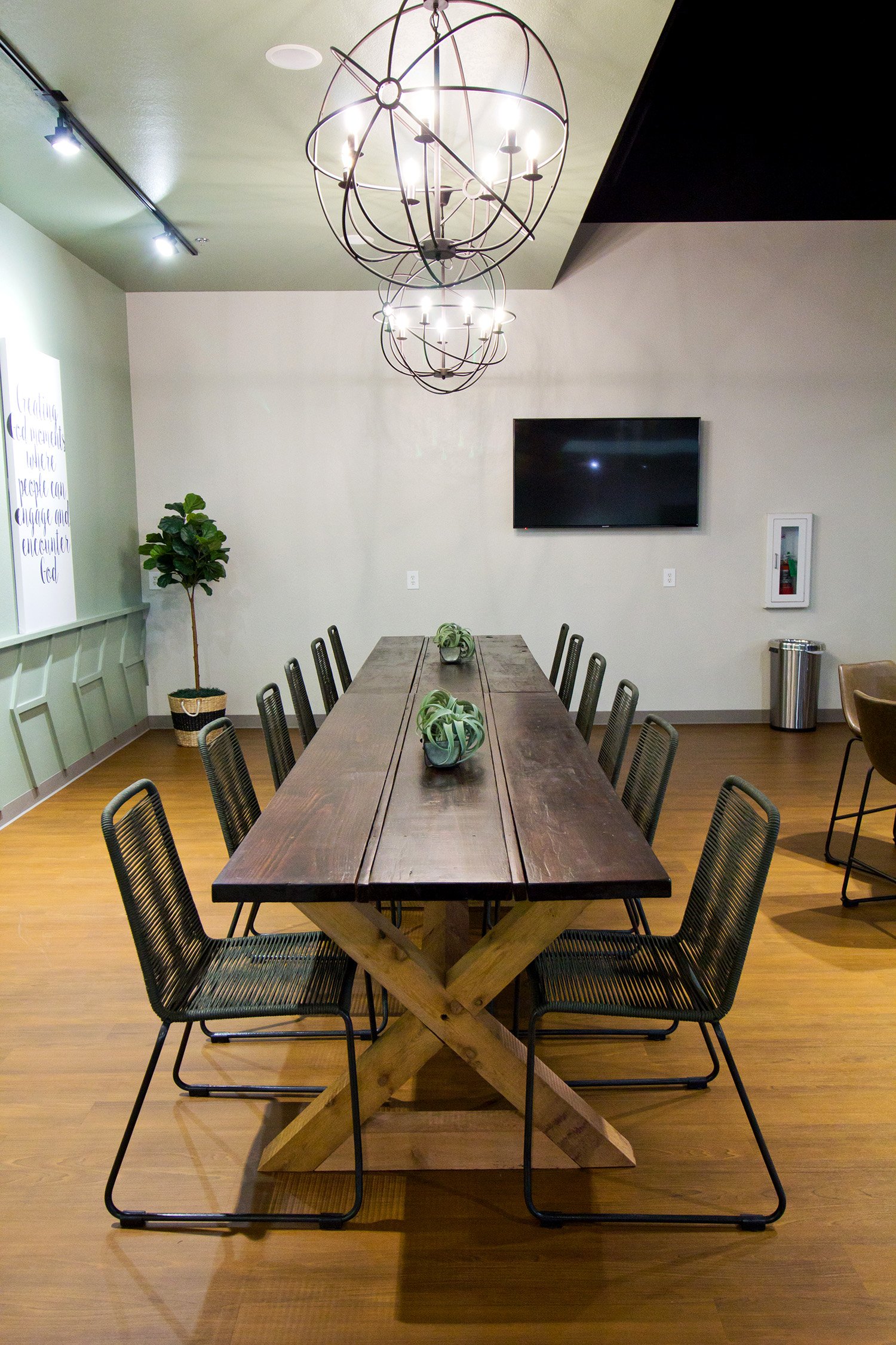
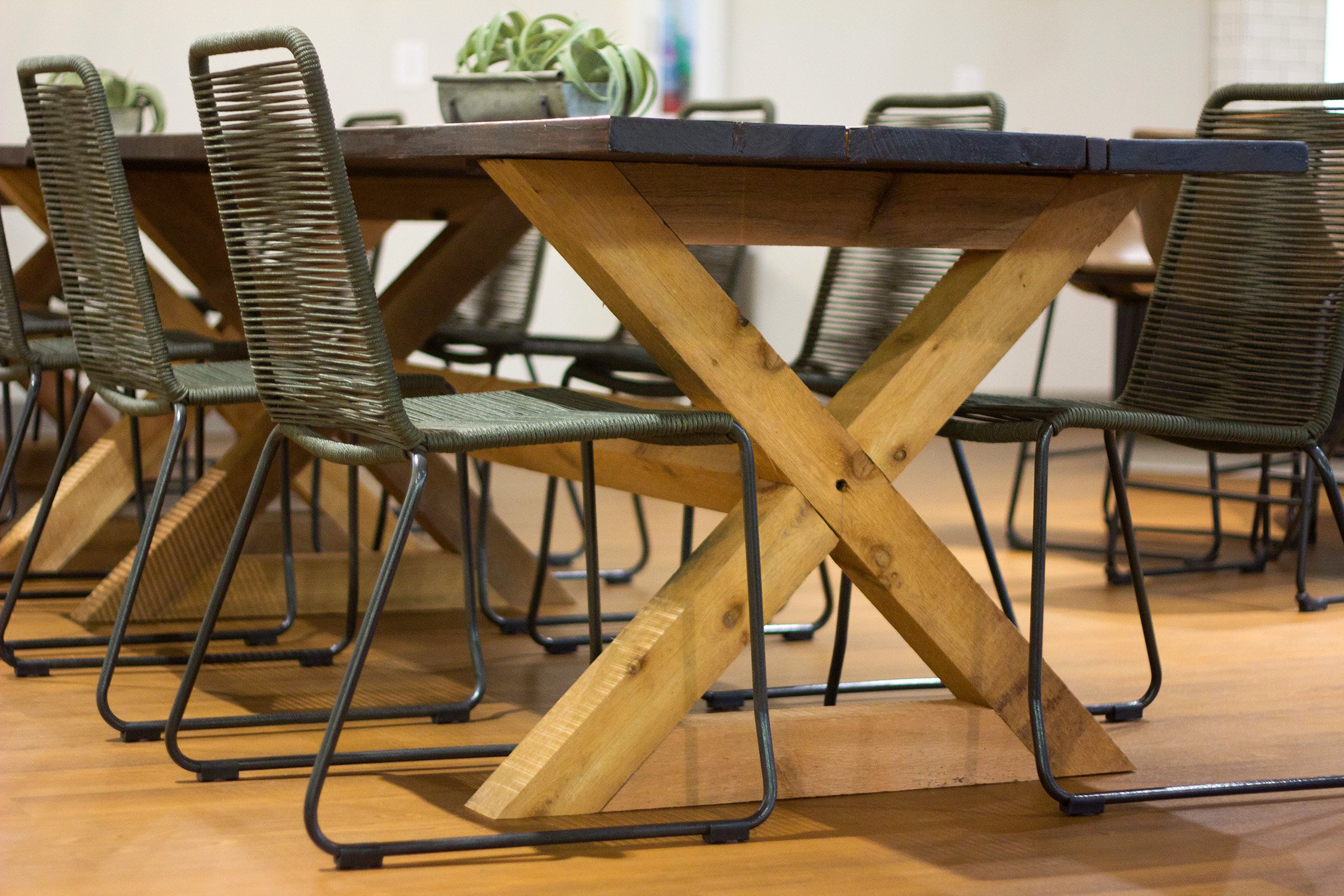
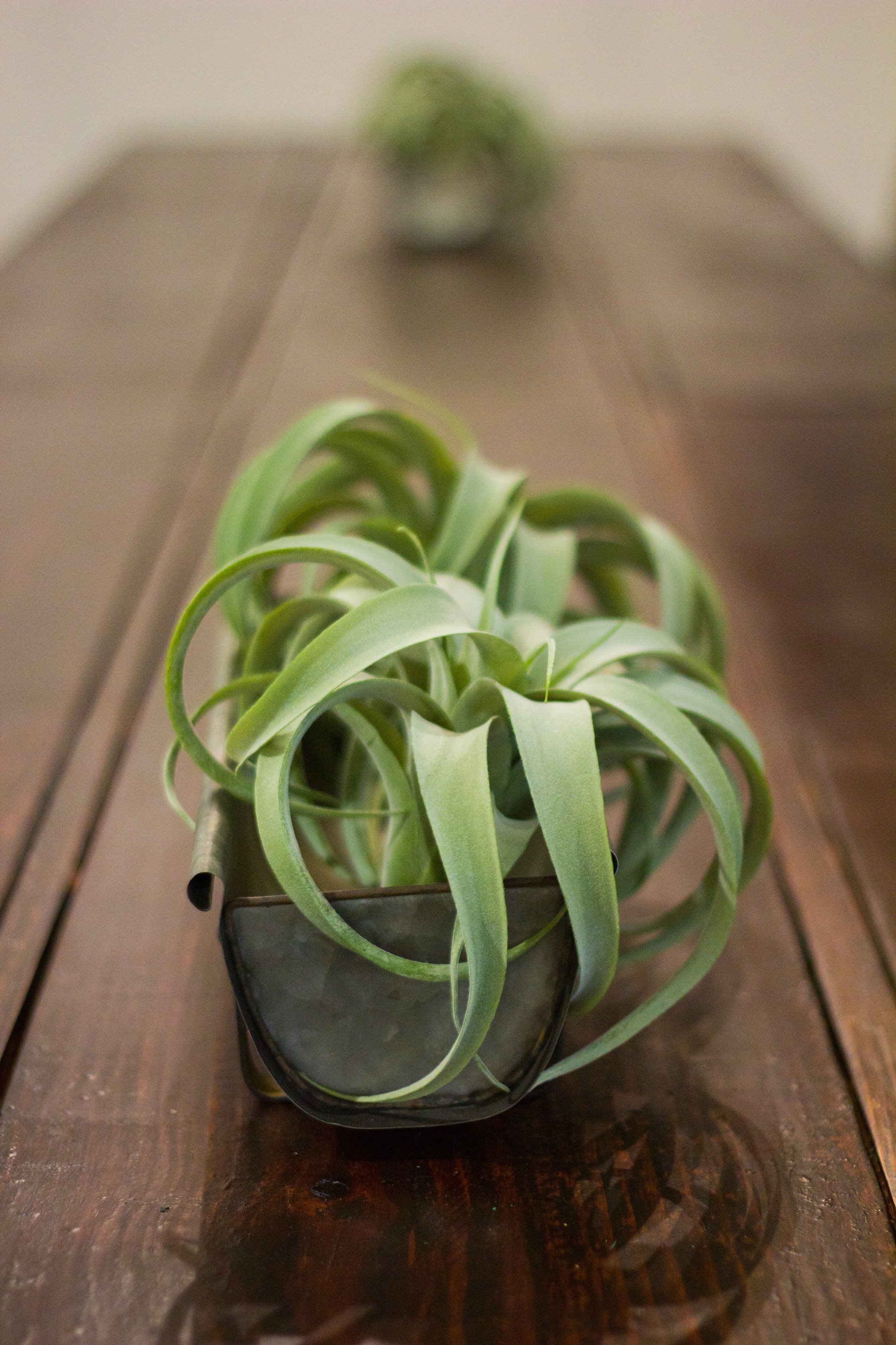
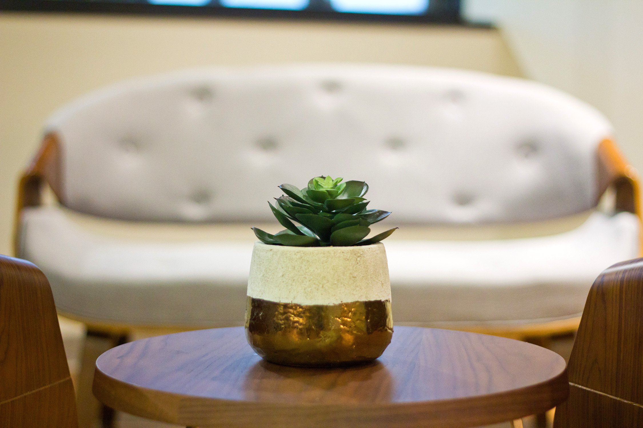
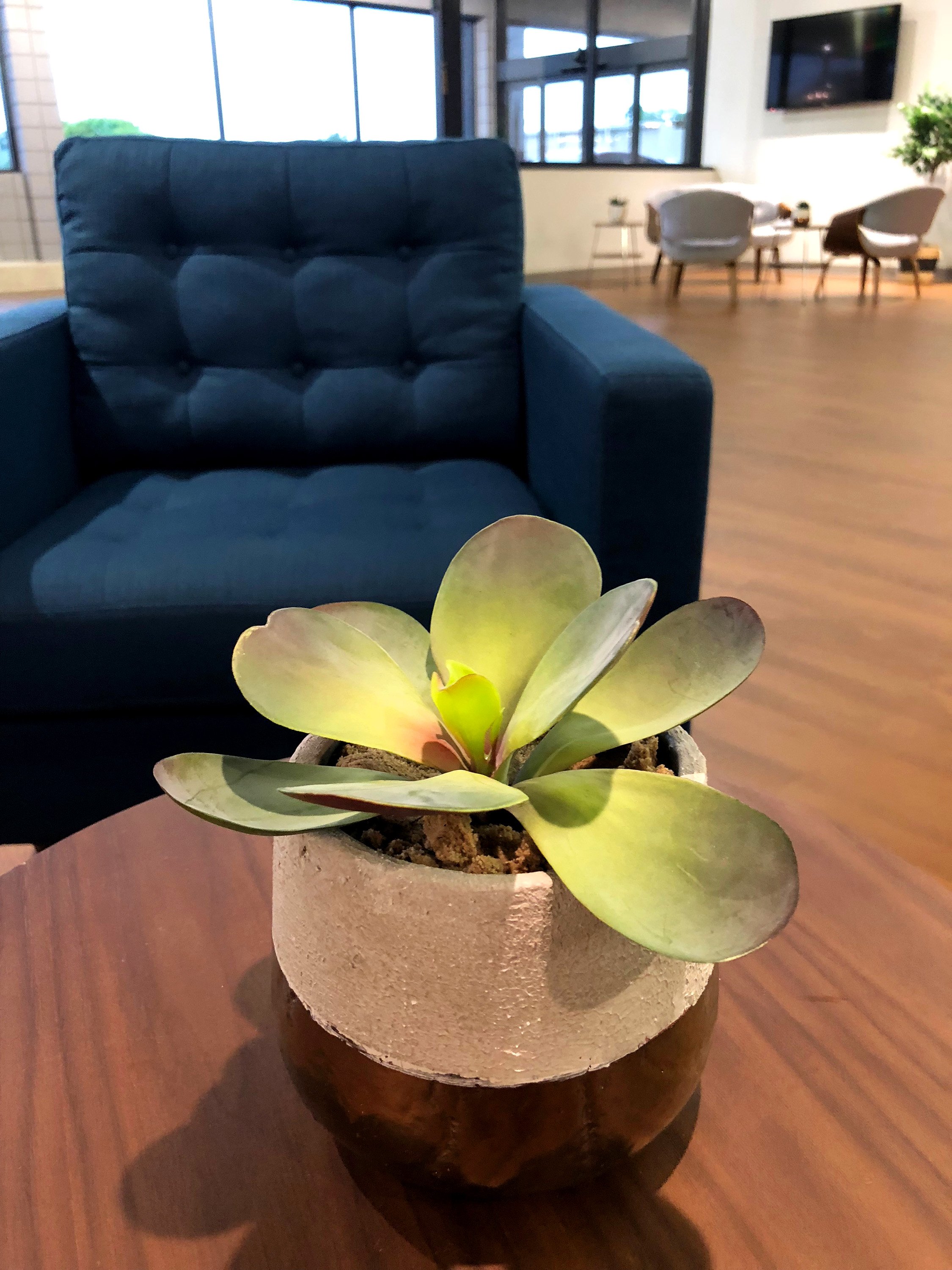
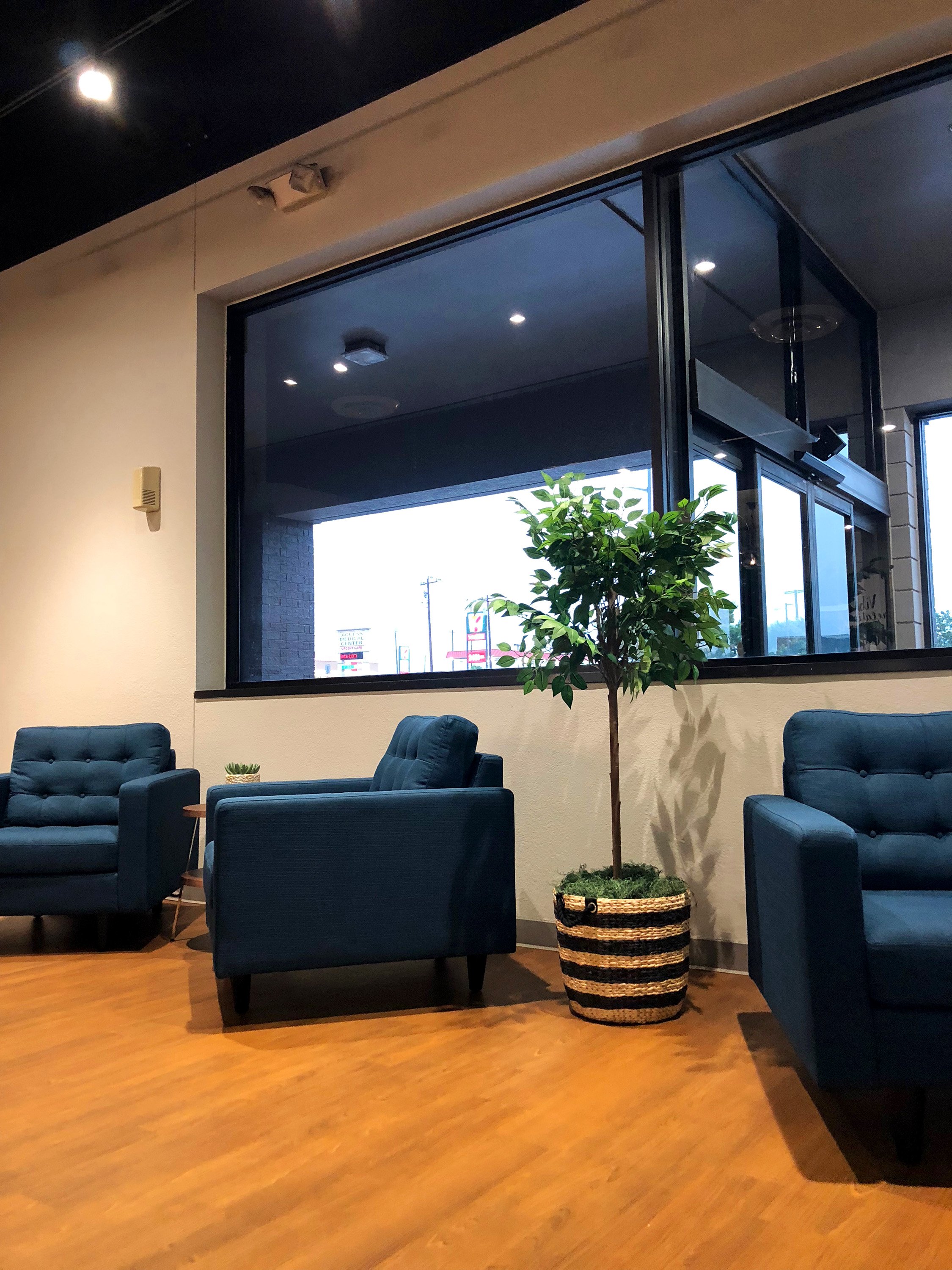
Café: The café provides the best location for both cozy overstuffed chairs as well as bar top style seating for donuts, coffee, and note taking. The new furniture had to be comfortable enough to sit in for an hour or so and sturdy enough for all shapes and sizes. GCD selected pieces with modern legs and arms to make sure the space didn't feel too soft. Nestled under three iron chandeliers are two eight feet custom farm style tables that come together to make one extra large dinning room table. Every piece in the space was designed to be flexible for everyday needs and special events.
Signage: It was important to keep the mission of the church front and center. Using a script font GCD made a custom wallpaper-look with the mission repeated over and over again from floor to ceiling between the two sanctuary doors. The high contrast of the black text against the white background is a focal point when you enter the church, helps designate the sanctuary, and serves as a pass thru. In the future, Cornerstone plans to create a custom oversized metal sign that will stand off the scripture wall with their newly branded san serif logo type. The same font was also used for signage within the new space for the welcome center and café.

