Catalyst Youth Facility
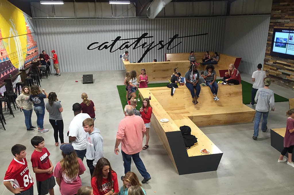
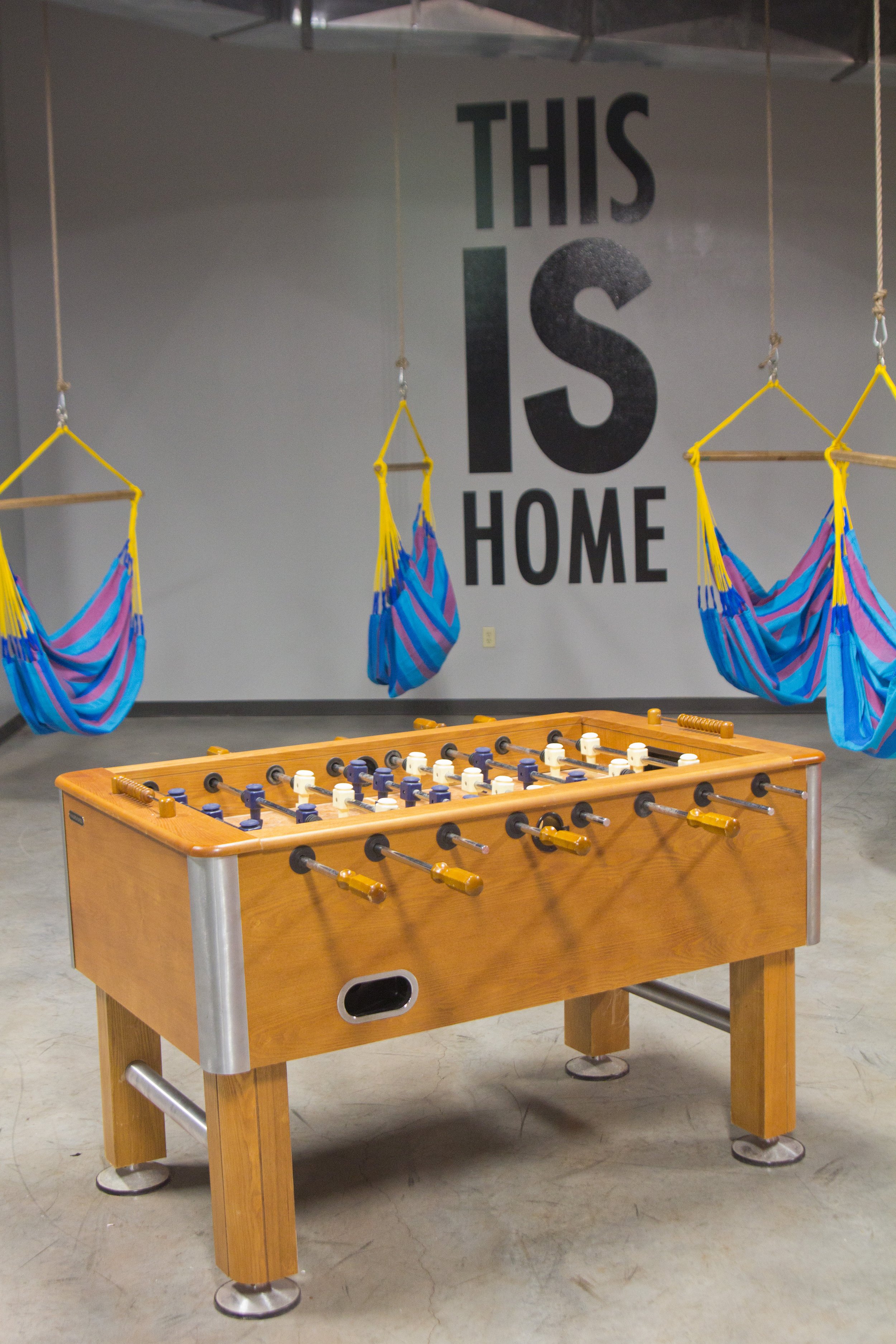
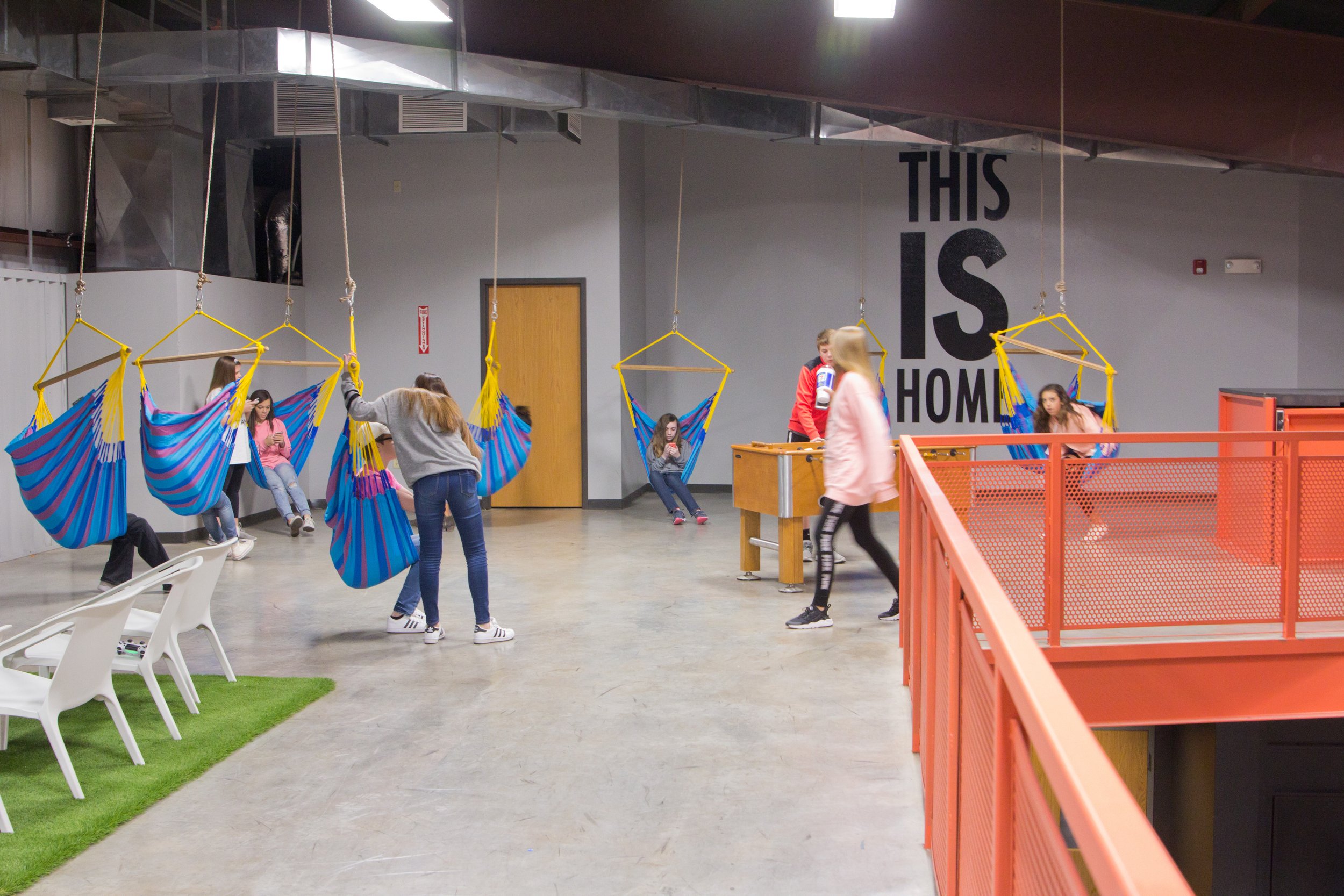
Catalyst Student Ministries wanted to create a space where teenagers would love to hang out. Housed in a large metal building, they needed a design plan that would work within their existing space. They also wanted to create a fun atmosphere that would encourage conversation and promote the feeling of family.
"My experience in working with Green Couch Design was extraordinary...
I was fascinated with the care and detail that went into, what I thought, was even the simplest of steps. This attention to detail from the start set me at ease and made me realize we were working with professionals whom we could trust. GCD made every encounter personal. In a world where we communicate mostly through technology, GCD took the time to make meetings personal with face to face communication. This enabled us to organically walk through the pros and cons of certain design elements with the professionals by our side, to help us the whole way. The work they produced was timely and efficient, yet did not lack quality in the slightest. They understood we were working from a budget, and took great care in helping us reach our design goal of developing a high-end look at a reasonable cost. GCD has a grass roots connection to community that enables them to call upon resources that might otherwise go unnoticed, giving each space a “niche” feel. Where other design companies might find everything on the internet, they were able to use local companies because of established relationships. We absolutely fell in love with our finished space. It meets our current needs but is designed to mold with us as we grow and change. We highly recommend this team not only for their acute eye for creativity, but because they are a joy to work with."
- Teah Marshall // Catalyst Student Ministries Pastor
Project Overview
Service: Commercial Design | Area: 8,500 SQFT | Budget: $80K
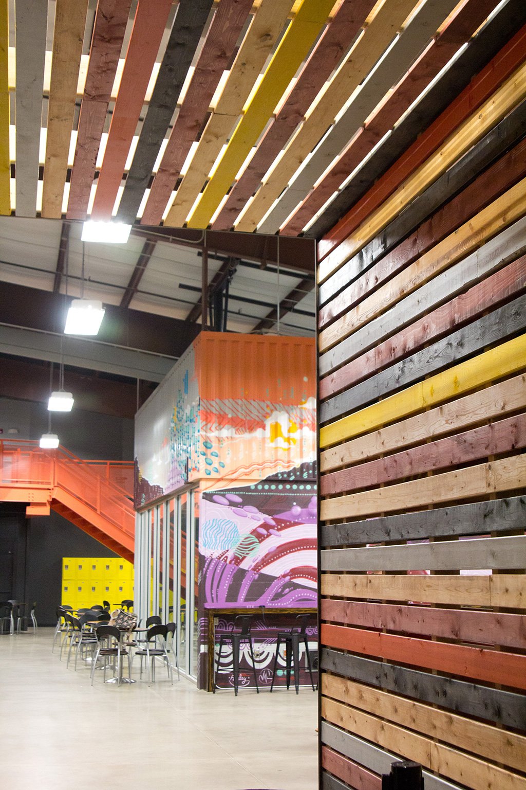
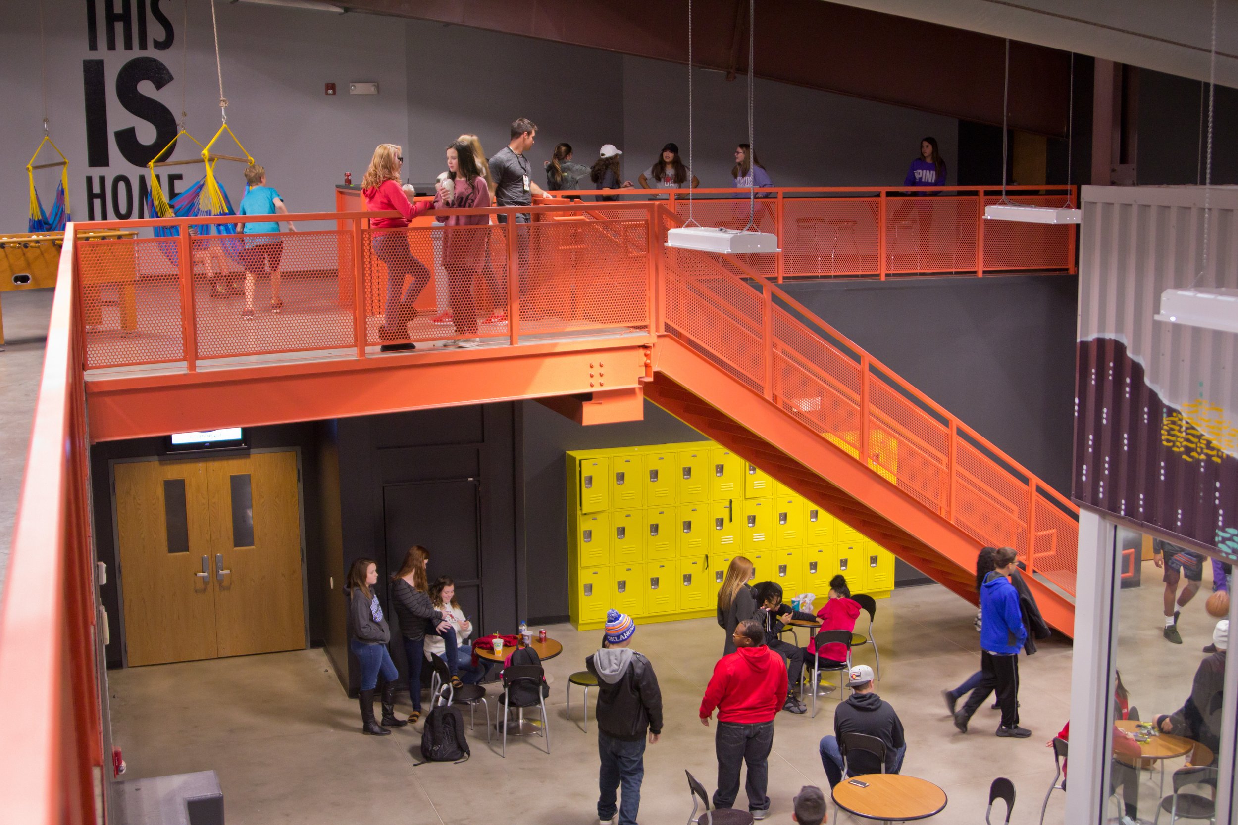
Looking to maximize their current space, Catalyst wanted to ensure their layout provided the best flow possible for activities, gatherings, drop-offs, and pick-ups. By understanding their functional needs first, the design and style fell right into place. Instead of trying to force the building into a more polished look (which would have cost a lot more money), we used its raw and exposed details to create a mood board we like to call, Urban Funk.
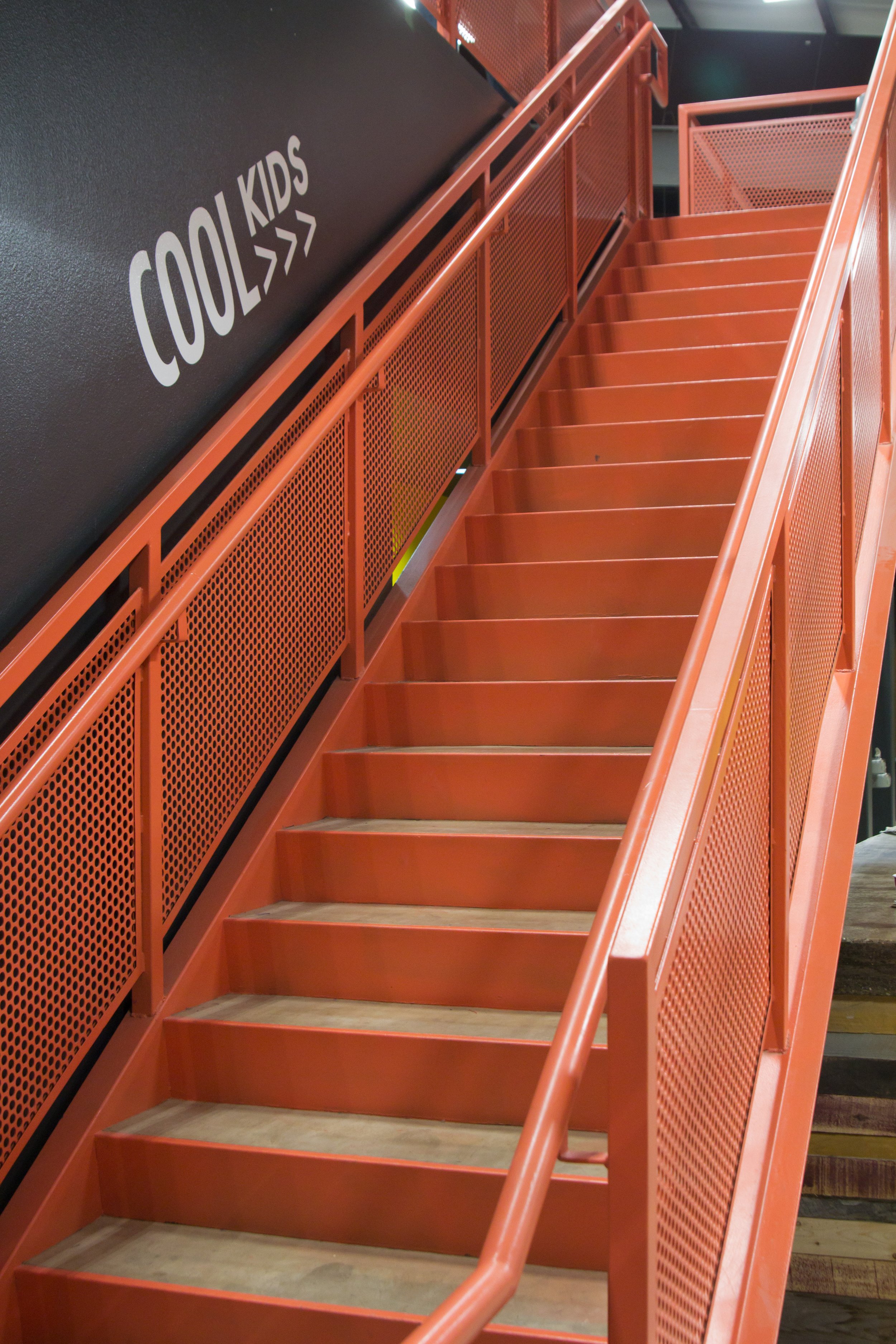
Paint: What once felt like an elementary school smothered in primary colors, is now a space where teenagers can't wait to hang out. We introduced bright colors to bring life and joy to the space, and balanced them with warm wood and concrete. One of the biggest hurdles was getting the kids to utilize the upstairs loft. By painting the upstairs railing and stairs a loud shade of salmon we created visual interest sparking upward movement along the staircases. Overall, the new color pallet pops and adds flare against the industrial finishes.
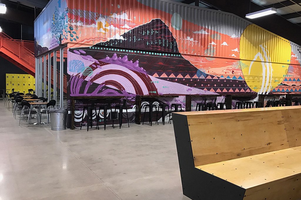
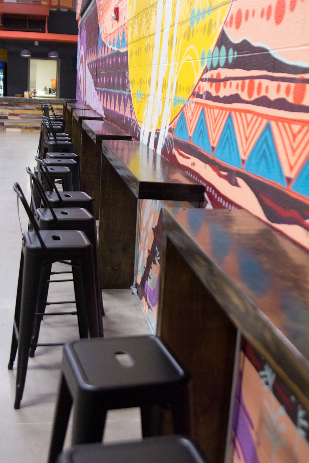
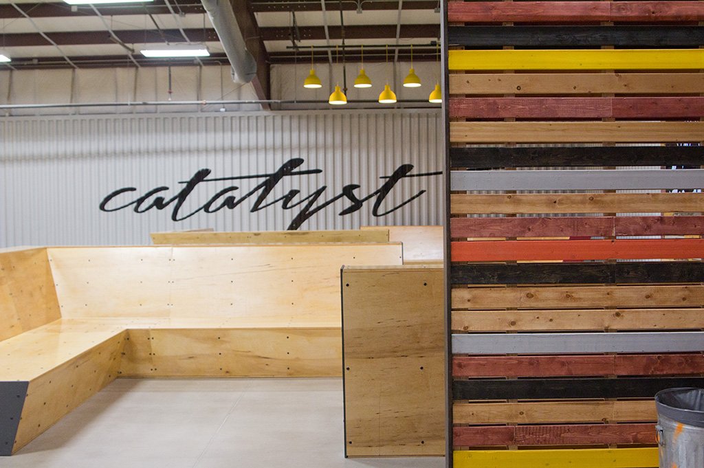
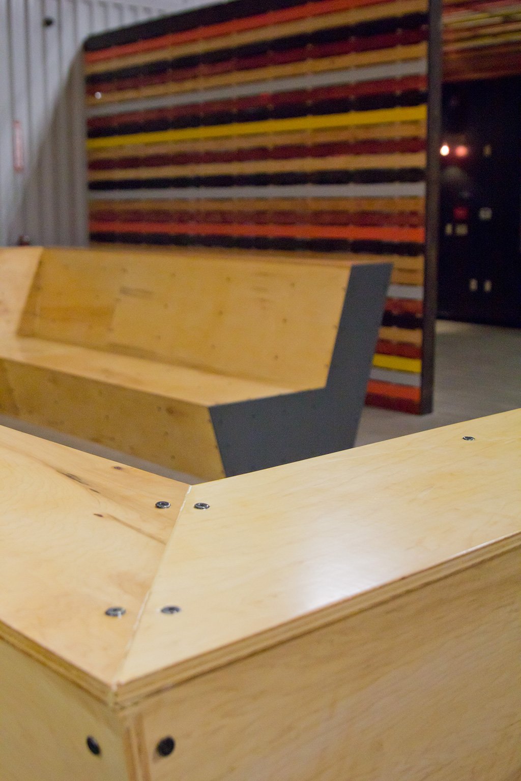
Seating: Four oversized wood sectionals face each other in pairs creating mini family rooms – with a twist. It was important to create mini-rooms within a large room for small group discussions. The tall seat backs established a more private gathering space when needed, while maintaining easy site lines for chaperones. Students were encouraged to sit or stand on different levels of the sectionals making them truly interactive and playful for casual hangouts. Metal stools tuck beneath long wooden bars designed as homework and food service stations. Lastly, eccentric chairs were dispersed throughout the space for visual interest, texture, and additional conversation areas.
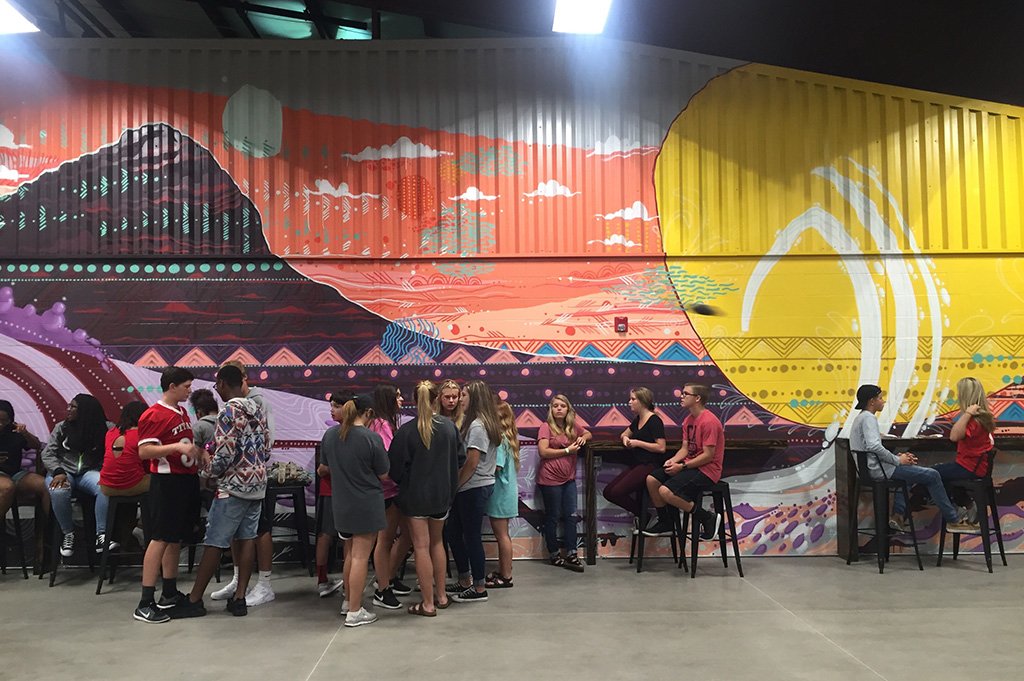
Mural: Due to the open floor plan of the building we needed a large design element that would tie the spaces together and guide people throughout the facility. After interviewing several local mural artists we selected Jason Pawley. His abstract landscape art adds a sense of awe and wonder to the space. The final mural design feels spiritual without being being too in your face religious. Overall, his exploration of color and movement brought a sense of vibrancy and excitement throughout the whole interior. The artwork has become an iconic area for Catalyst Student Ministries, and it is also a favorite place for selfies.
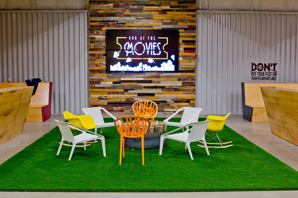
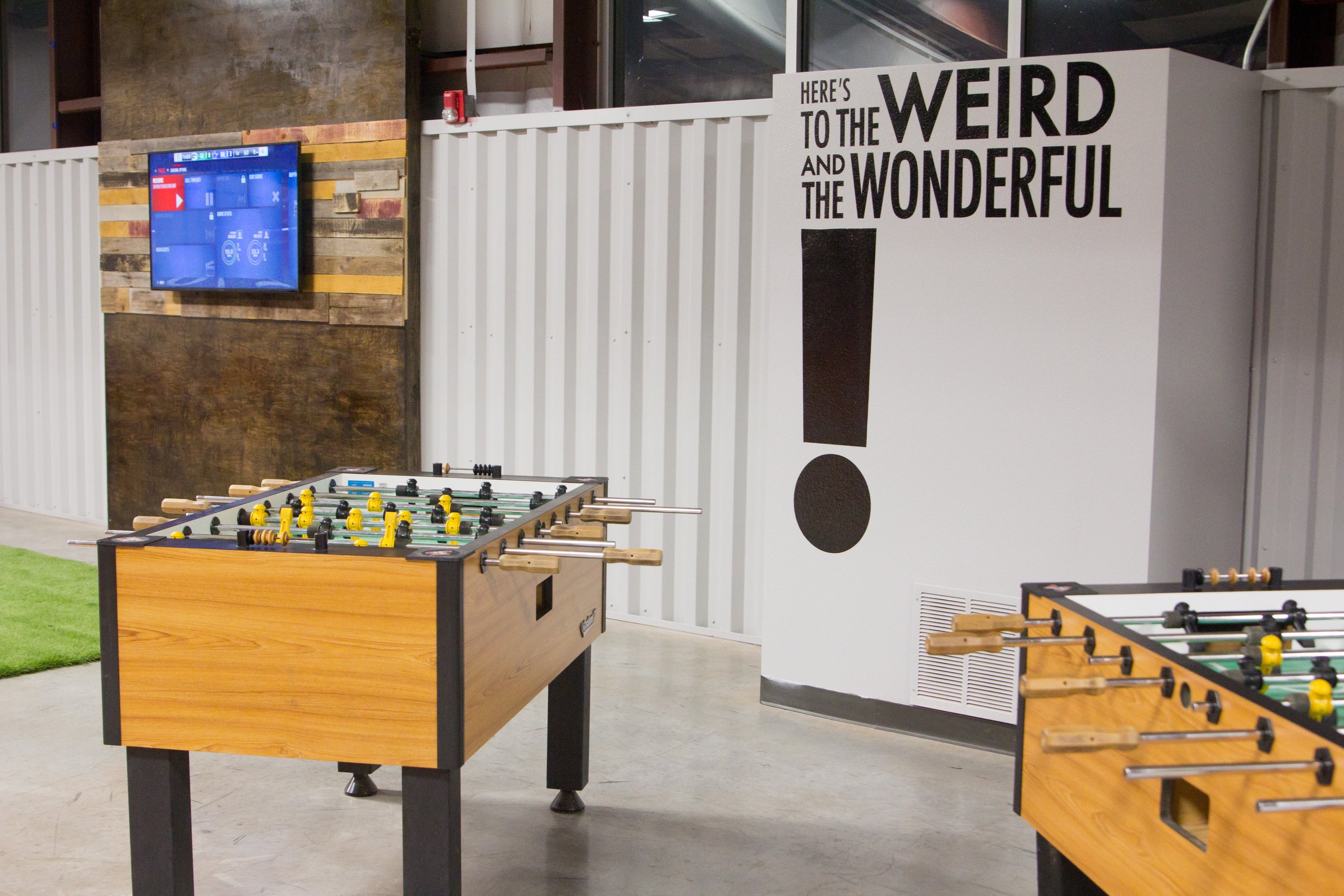
Media Mantle: What's homier than a fireplace? The Media Mantel was our way of creating a fireplace mantle without the fire. It is the one vertical piece within the whole space. Expanding from floor to ceiling, it creates an over the top visual interest that centers the room. Four large TV's come together as one, or they can be divided into four separate screens to display event graphics, images, fun tweets from the night, and the occasional movie or football game. Additionally, smaller matching media mantles were constructed in the loft space of the building for gaming.
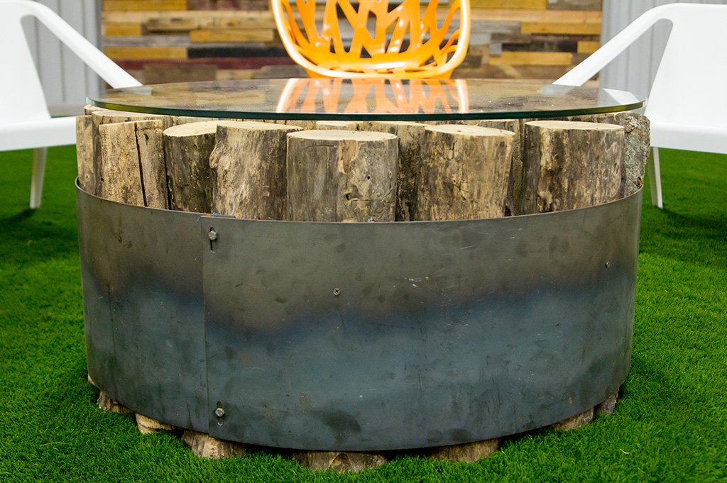
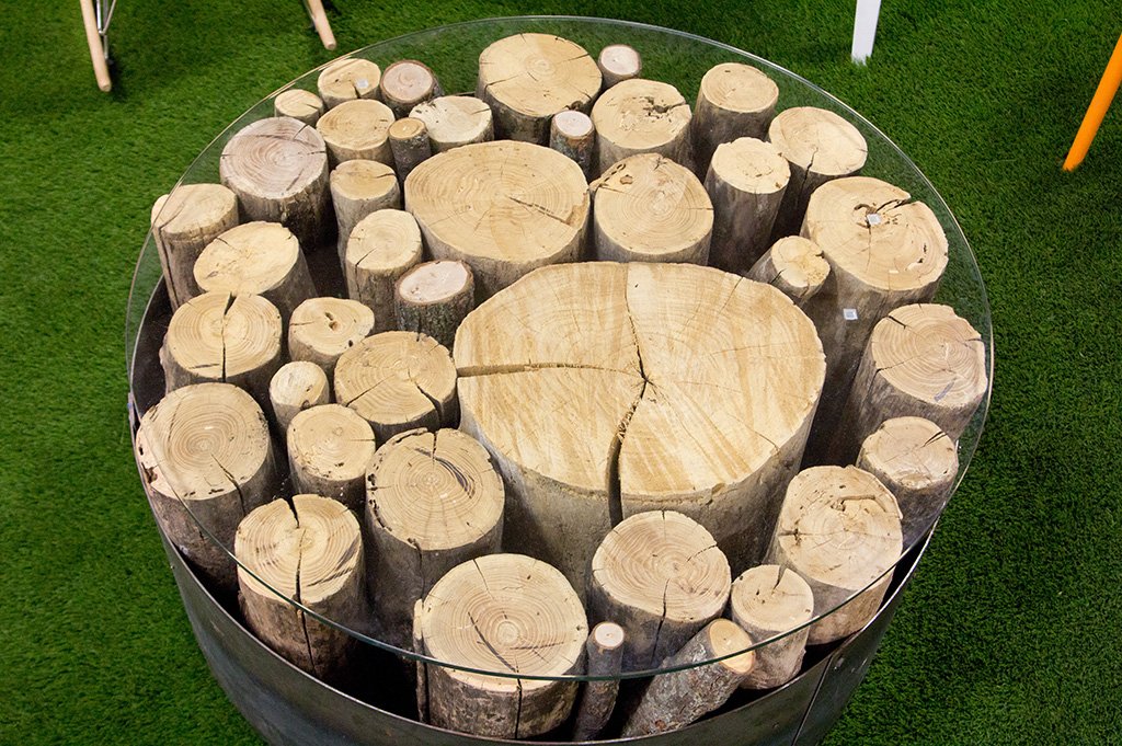
Fire Pit: There's something about gathering around a fire pit that encourages conversations and connects people. Although we couldn’t have a real bonfire in the space (something about code, youth, and flames?!), we still wanted to bring that same campfire feel to the interior. The custom coffee table was made from a fire pit ring and chopped wood you'd find in a wood pile. Each piece of firewood is cut to the exact length, then set-up vertically in a circle to create the tabletop. Lined with a plexi-glass top, the piece has all the same materials connected to a bonfire, without the liability.
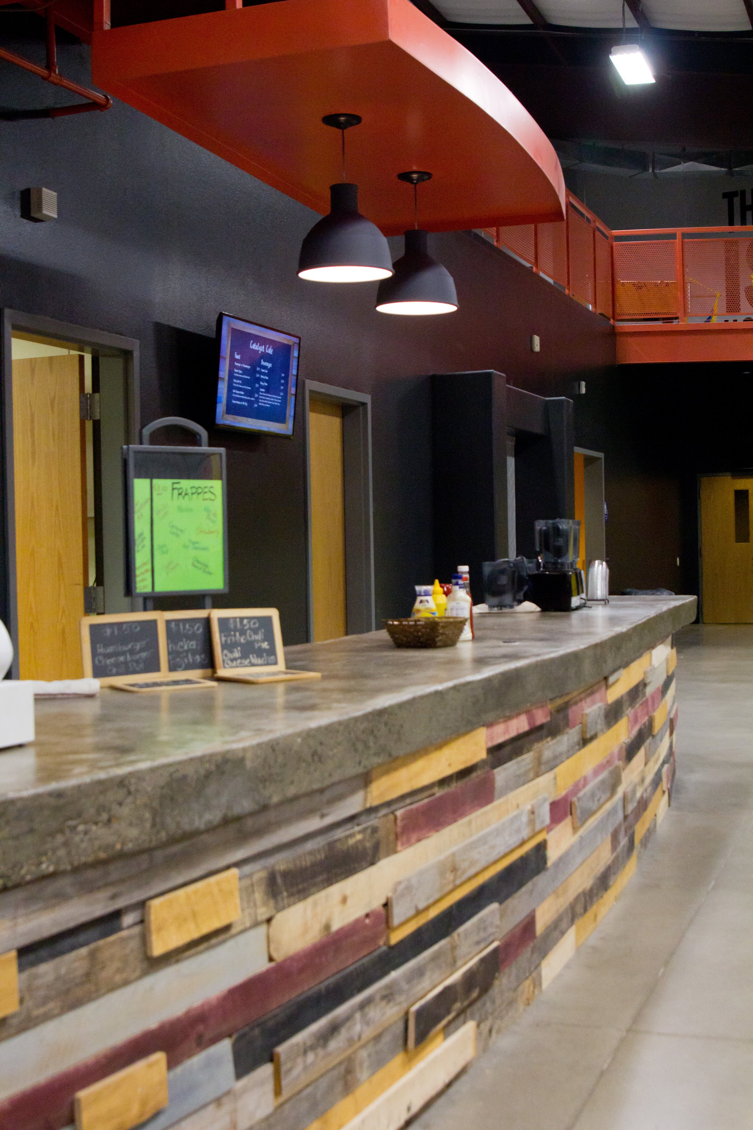
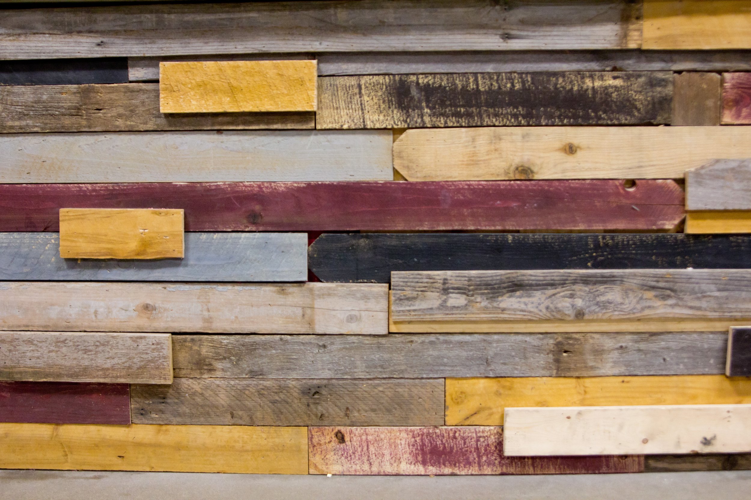
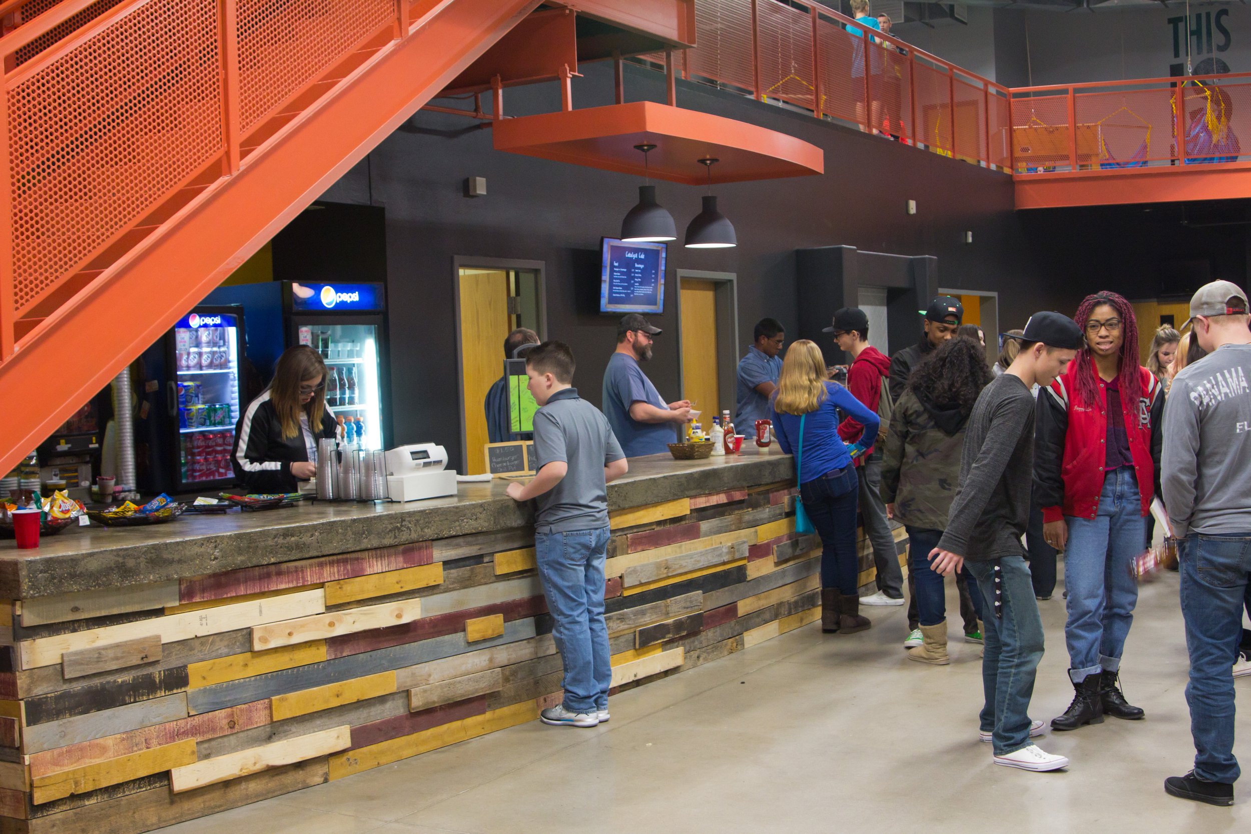
Coffee Bar: The same recycled pallet wall that was created for the Media Mantle was reflected on the base of the coffee bar. Concrete counter tops and new industrial lighting were all framed by a bright yellow wall and the salmon colored stairs.
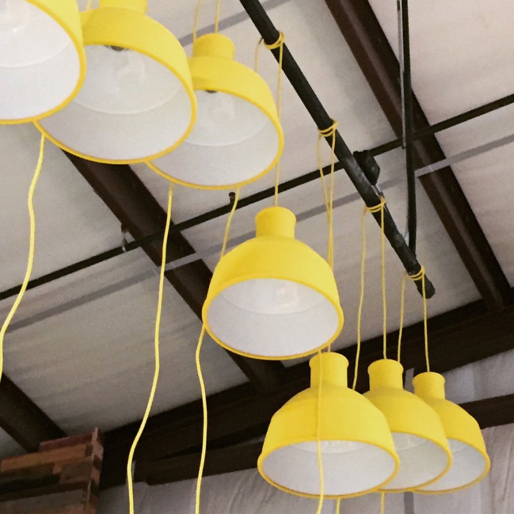
Lighting: With such a large space lighting was a key element to help give the space personality and warmth. Budget would not permit extra large fixtures, so we opted to buy several single lights and wrap them together around a metal pole. This design touch made clusters of single lights appear as one large fixture, but at a fourth of the cost.

